Artwork by by Michaela Monschein, Drawing Academy student
Still life with oranges, lemons, a cup, and a pot
Dear Drawing Academy,
In my drawing I focused on shading and on round and oval shapes. It depicts citrus fruits, a pot and a cup on a table with a white table cloth in folds. In the background hangs a piece of grey cloth.
My areas of problem were the folds of the tablecloth and the surface structure of the fruit. I redid the folds about 5 times. I always tried to think of it as a 3 dimensional body, constructed of prism like shapes, but it was hard to draw realistically. That the tablecloth was white did´t help either! In the end it turned out a bit “lifeless”, I think.
As mentioned above, the surface of the fruit was the second problem. All this little bumps and holes, I have not really an idea how to construct these. In the end I just made tiny dots, but I’m not very happy with them, so I removed them. I did a picture with dots and without. Well, the surface structure was a problem, but I was more focused on the forms and on shading in the moment, perhaps I should redraw the still life later, focusing more on the details. Maybe I should use a charcoal pencil to get more depth and to darken the shadows. I did this project just in HB and B pencil.
What I realized first on the photo is that the opening of the pot is a bit crooked, in my drawing, it´s not that obvious.
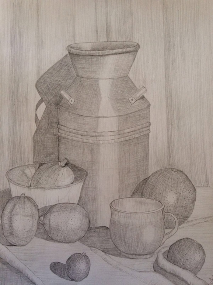
Your critique is much appreciated!
Yours,
Michaela Monschein
Dear Michaela,
Many thanks for your still life drawing. It’s great that you draw from life – this is the the best way to learn and improve your drawing skills.
Your drawing looks very good and you put a lot of efforts into this work, well done.
It is also good that you see areas that require improvement and are not entirely satisfied with results. This means you have plenty of room to grow and improve your skills.
Apart of your concerns about rendering tonal values and depicting small details, there is one bigger challenge you need to solve – constructive drawing.
Think of applying tonal values and drawing small details like painting and decorating walls of a house. However, if a house is not well-built, decorations wont help fixing tilted walls and a wobbly foundation.
You noticed that the top oval of the pot is skewed. This actually is not critical – the water-can can be old and deformed and this crooked outline looks rather charming. What really requires fixing is the construction of the can.
The main skill you need to learn is how to draw what you know, not copy what you see.
You know that in your still-life one solid object cannot intersect another item. However, this is what happening with the water-pot and the bowl.
In the image below, you can see that the projection of the pot intersects the bowl’s projection (red area), which is impossible in real life.
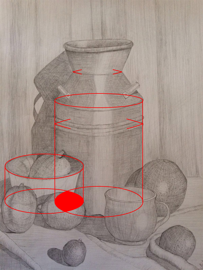
There’s another thing you can easily improve on – drawing correct ovals. An oval is a circle that is seen in perspective and therefore foreshortened. No circle has sharp corners, so no oval would have pointed edges. This mistake is easy to avoid when you apply one of the constructive drawing principles – draw objects as if they are transparent.
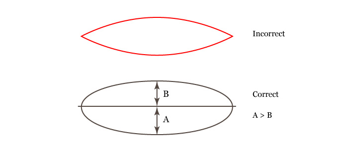
You are doing a great job when drawing fully visible top ovals of cylindrical objects; however, ovals that are not fully visible also need to be constructed entirely, not only the visible half.
There are other bits in your drawing that can be improved, like contours of the inner and outer walls of the bowl, construction of handles, uniformity of outlines, aerial perspective and so on.
Regarding tonal rendering, HB and B graphite grades are sufficient to make a fully rendered artwork. It is not about pencils, but skills.
Actually, to improve your skills faster, you can work in one pencil grade – B or 2B, for example. Sharpen your pencils well and practice making smooth tonal gradations from very light almost invisible strokes to dark values applying hatching in multiple layers. Relying on grades of pencils or some darker media like charcoal is an erroneous approach when learning how to draw. Tools can be taken away, your skills are for life.
The challenge in your case is not with the depth a pencil can provide, but with the contrast between tonal values. Many areas of your drawing are rendered with the same mid-range values, thus making the artwork a bit dull. When rendering tonal values, constantly compare various spots of objects and analyze what area is darker or lighter. Seeing tonal values is a skill that has to be developed by any artist.
It is hard to say what place in your drawing should be the darkest as you haven’t solved this question. Rendering values should start from that place, but not in the full strength, and deepen gradually layer by layer, going from dark values to mid-tones and finally to light areas.
Also, you need to develop your unique “hand-signature” of beautiful pencil strokes. It is good that you’re applying strokes along objects’ contours, but those marks are rather uniform and missing a “poetry” of lines. This is not easy to achieve, so you have to look on good examples of pencil drawings and practice your hatching style persistently.
Please check below pencil artworks by art students and artists as an example of constructive drawing, tonal rendering and quality of lines.
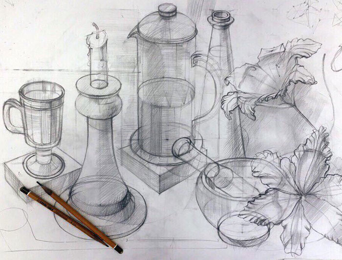
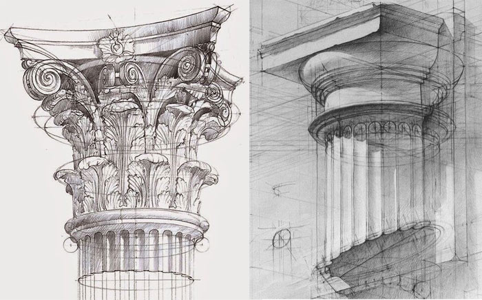
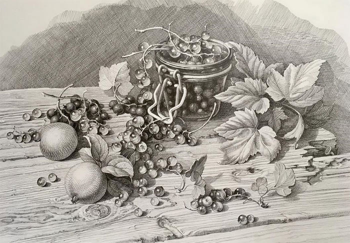
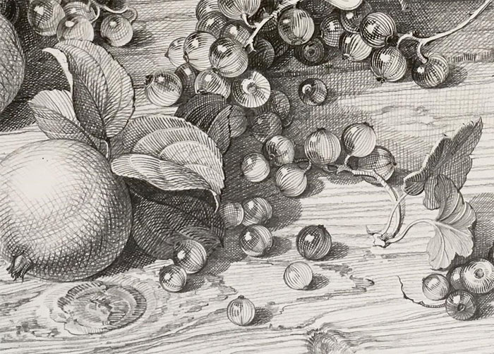
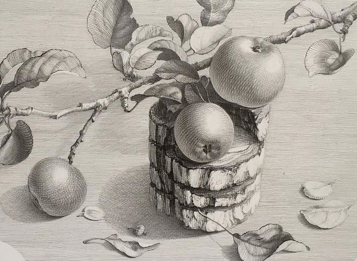
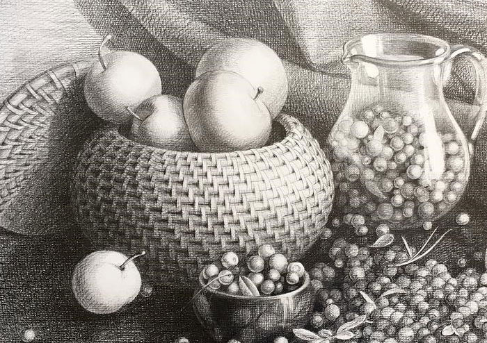
I hope this gives you enough to think about and improve on.
Once again, thank you for your wonderful still life drawing.
To your creative success,
Vladimir London
Drawing Academy tutor
To learn professional drawing techniques,
Enroll in the Drawing Academy Course
Pay once - Enjoy forever!
Only $297



Excellent critique.
Wow! Thanks! Very helpful!
I really like those drawings especially column capitals. I haven’t seen such level of mastery and understanding of perspective anywhere else!
me too – i’m thinking of quitting my art college now as my art teachers look like a bunch of amateurs comparing to this drawing course ; )
Those drawings are done so beautifully. Very inspiring! Who are the artists? I would love to see more of their work…
Hi Yasmin, thank you for your feedback. The artist is Marina Orluk from Saint-Petersburg. Geometrical objects still life and capitals are works by Russian art students.