Article by Yvette Mpinga
“Let there be light’, a phrase that Rembrandt Van Rijn allowed to become the motif of his work throughout his entire career. Solidified in history as the most important figure in the history of Dutch art.
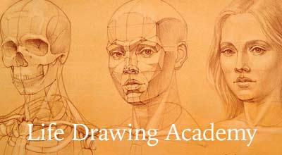
The following article will be a part analysis and part appreciation post, we’ll be observing his techniques at creating such complex works. as he is one of my favourite artists and every piece he created has a thousand lessons hidden in their strokes and etches. If you have any agreements or disagreements, please write them in the comment section as I’d love to hear what you think.
Rembrandt knew how to navigate tonal values in his etchings with such a great level of precision and detail, that over three hundred years after his death, it’s just about impossible to find a single artist that can replicate the way he emotionally channelled light through his artworks. I can’t condense his genius into one sentence, but I can give a vague assumption of how he commands your attention. He wants to tell a story, so he lets contrast do the talking.
The simplicity of this principle is one that would overwhelm many artists today, and it most likely did the same for many of his contemporaries at the time. In a world as competitive as art, the only way to stand out is by going all-out, leaving no creative stone unturned, indulging the canvases with as many complexities as an artist can think of just to hopefully make an imprint. Sometimes this worked, sometimes this failed, critics praising those who went outside of the box and criticizing those who did the exact same thing. History is full of many such examples, but whenever there was a brave enough soul who was okay with abandoning the status-quo, success ensued.
It is estimated that about 1,400 of Rembrandt’s works were sketched drawings, which were published, that is. The humour in this situation lies in the fact that Rembrandt’s sketches sold (and still do sell for) more than the average piece. In any case, it’s no mystery how Rembrandt became an icon both of his time and in this age. He was all about simplicity, and with that simplicity he created contrast, more specifically contrast with light.
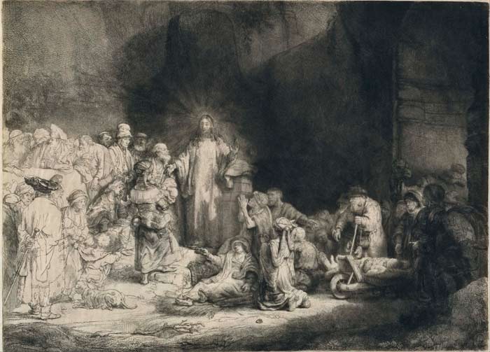
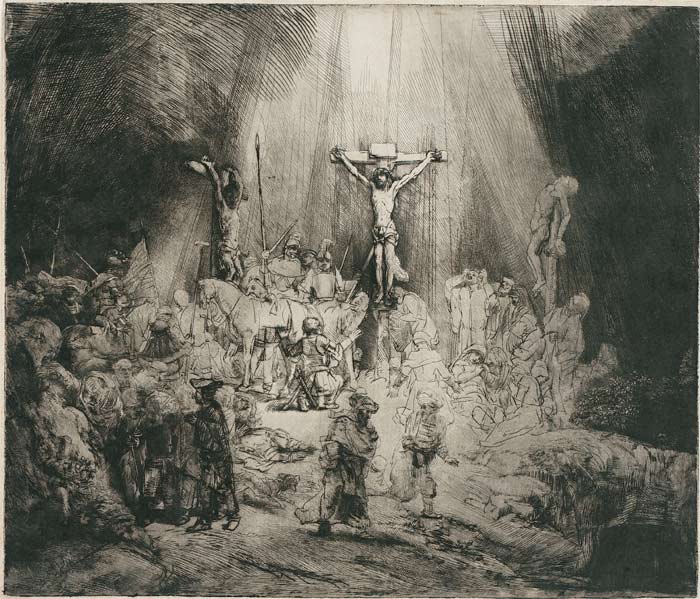
This is evident in the first piece that we will be analysing, called the ‘Hundred Guilder Print’. This piece is significant because of how there’s a million and one things happening at the same time, the main point of reference being Matthew 18 (which includes various parables/instructions from Jesus, including Ranks in the Kingdom, Stumbling blocks and Ninety-nine plus one). We see the children that Jesus talks about in this verse, as well as the tax collectors, the gentiles, the Pharisees, the sick and crippled, Christ crucified between the two thieves, also known as ‘The three crosses’ is another exemplary work of Rembrandt’s unparalleled command of light. The composition of the piece consists of thirds, with the middle being the primary focal point. A bright god-ray is shining upon Christ on the cross, drawing attention to his person, while remnants of the light are spilled onto the rest of the crowd, the shadows slowly increasing towards the edges.
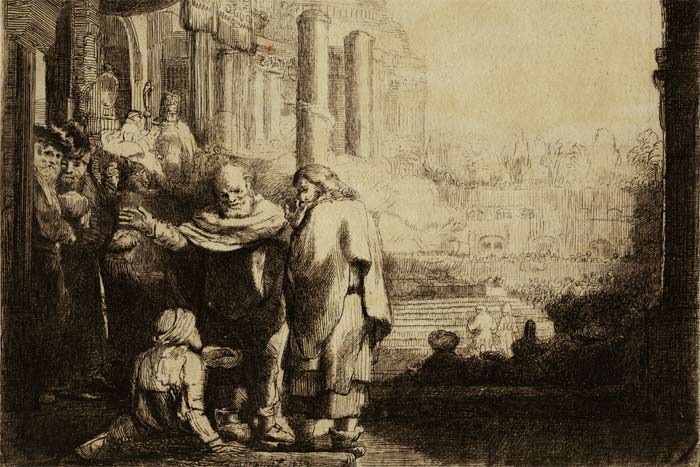
Similarly, these techniques can be found in the last piece we will be looking at from him, the ‘Peter and John at the Gate’ etching, in which the aforementioned heal a man who has been paralysed since birth.
What makes these pieces so captivating is the contrast. Now of course it goes without saying that a general rule of thumb, contrast is going to naturally occur anyway in etchings, for example a standard black and white (and/or light and dark) scheme, but various techniques are used to create further contrast. However, it’s not just light and dark, it’s hard and soft shading, lines to illustrate precision and smudges to create atmosphere. Round and square shapes, he sketches humans with curves and arcs, as we are naturally created, but the backgrounds have sharply drawn lines that dictate their nature. Rembrandt doesn’t shy away from using primitive shapes, spacing and grouping, he groups the backgrounds as one ‘big shape’ and lets them become completely entrenched in either light or dark, with faint markings to allude distance and atmosphere, this is also an excellent way of showing off his knowledge of perspective which creates further depth in his piece, and loose, circular and natural strokes to compose the bodies of the humans.
His etches are haunting because he’s not afraid of simplicity, and how he tells biblical stories with plain but potent emotion. Rembrandt was completely fine with abandoning complexity (like the kind he does in his paintings) to give the audience a true and honest form of events from days gone by.