From Anna Festa
 Hello,
I want to thank you again for picking me to be one of the winners for last month. I am enjoying it thoroughly. I would like to submit a before and after sketch to see if there is any improvement. I did one a week before I started your class, and have done several since. I never knew smudging was not accepted in the school of higher learning, but I must admit that cross hatching, although a challenge, makes the picture look a little more realistic.
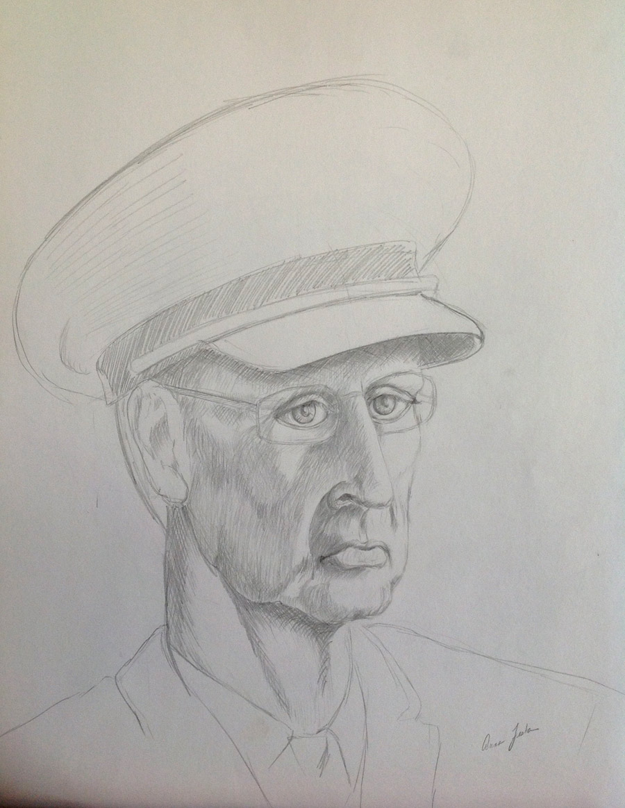
 I go to a portrait group once a week, and they told me that this method is making my pictures look like I am an illustrator. This is what I came up with after an hour and a half of working at it. I went home and worked on it a little more. I will send you the revised one shortly.
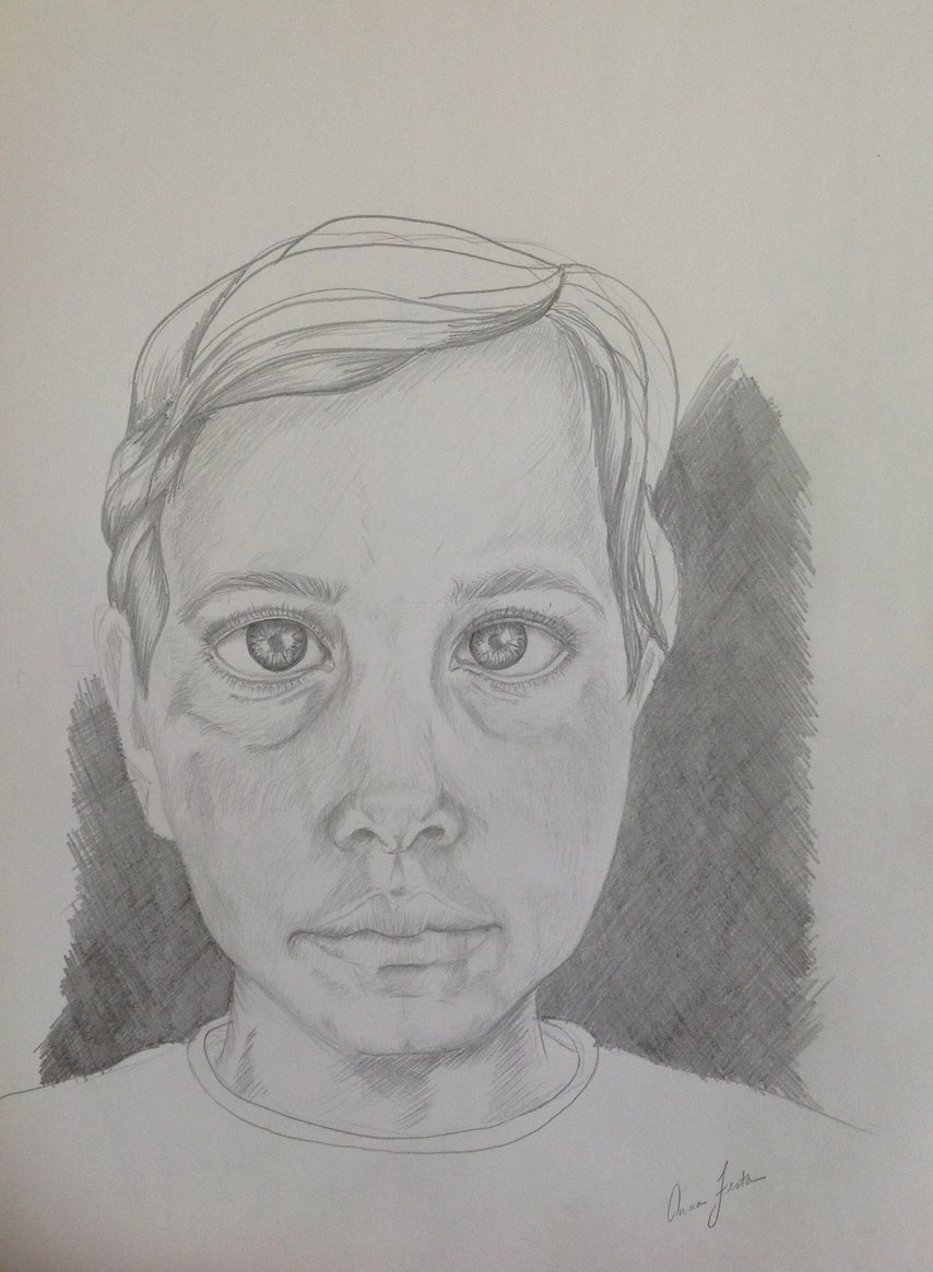 How to make this drawing realistic? It looks cartoonish to me. The child is naturally cross-eyed. The portrait doesn’t look realistic.
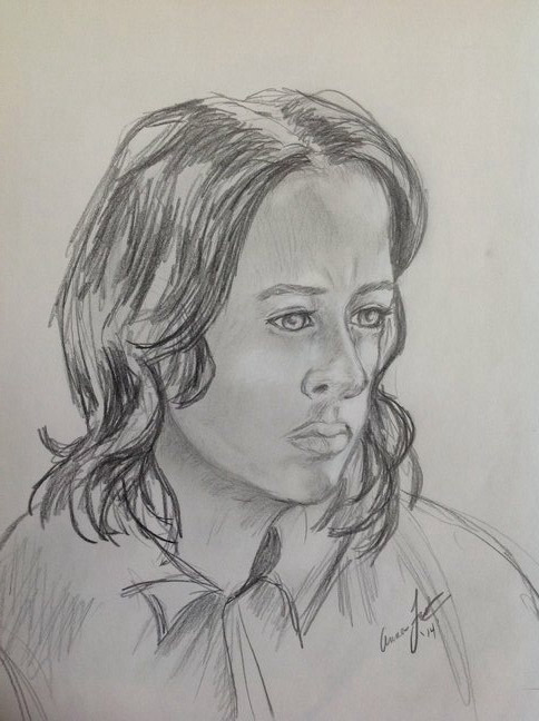
 How can I improve? I am not quite getting a three quarter view, the eyes look wrong.
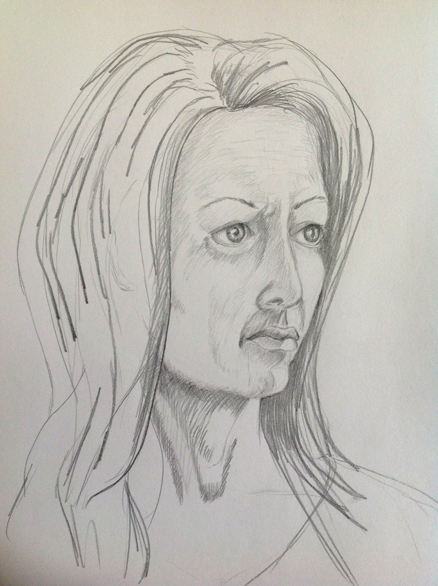
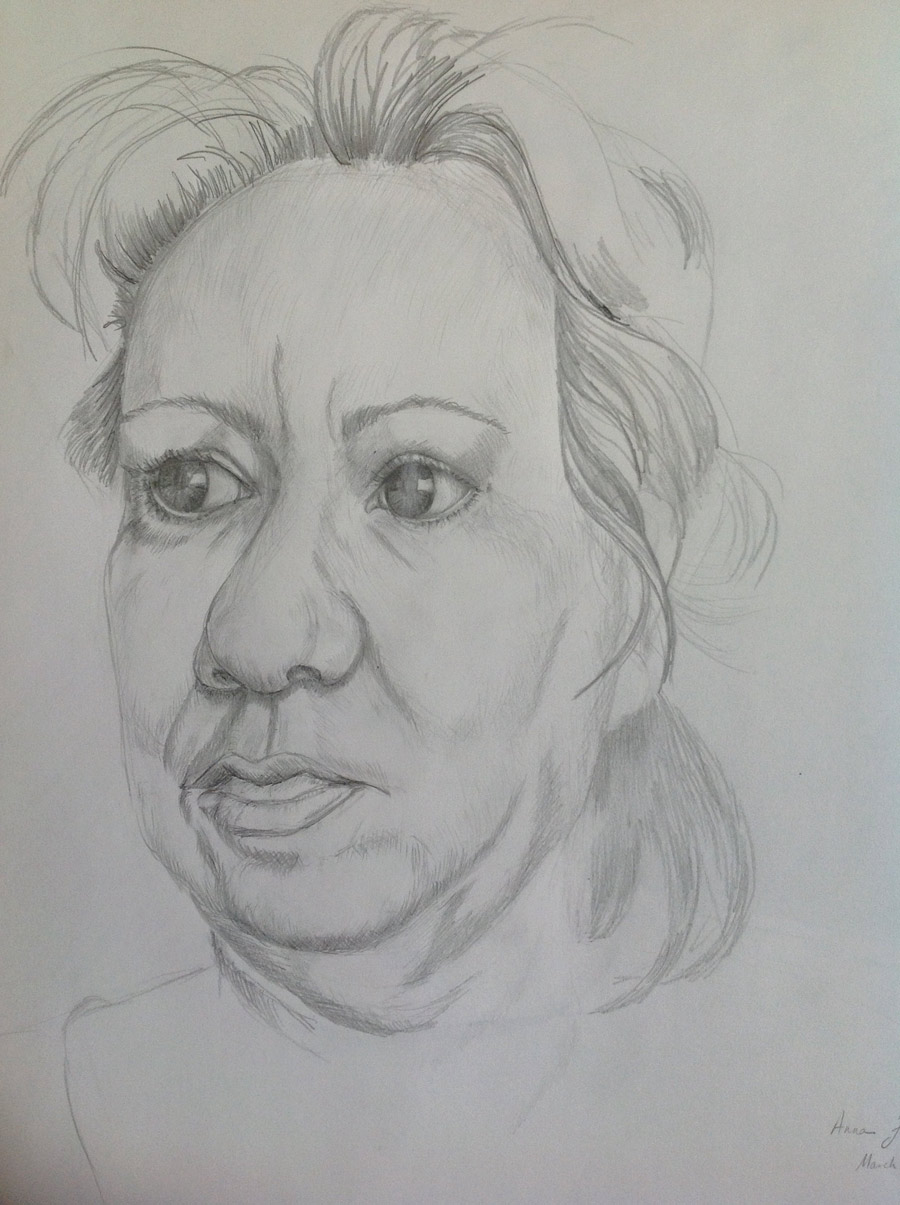 This is a picture I did shortly after receiving the Drawing Academy course.
Dear Anna,
Thank you very much for your drawings. You have a good start and I really like that you want to improve. It is important to see mistakes in your own artworks and not to be satisfied with results. In this way you will develop your portrait drawing skills going forward.
All of your artwork has a characteristic style and, I believe, they have likeness as well.
However, there are some points you might want to improve. I will list them as follows:
Composition
A portrait looks best when the head is positioned slightly higher than the center of the paper.
Also, make sure you have “lead” or “nose” room, which means that the distance to the paper’s edge in front of the subject is greater than the distance behind.
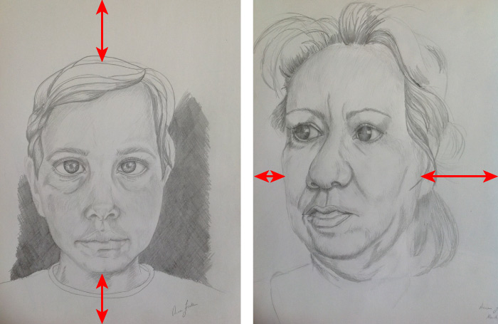
Some of your portraits do not follow these rules.
Constructive drawing
A proficient fine artist draws what he or she knows, not what is seen.
You know that the horizontal line of the eyes, the line of the root of the nose, and the line of the mouth are parallel to each other.
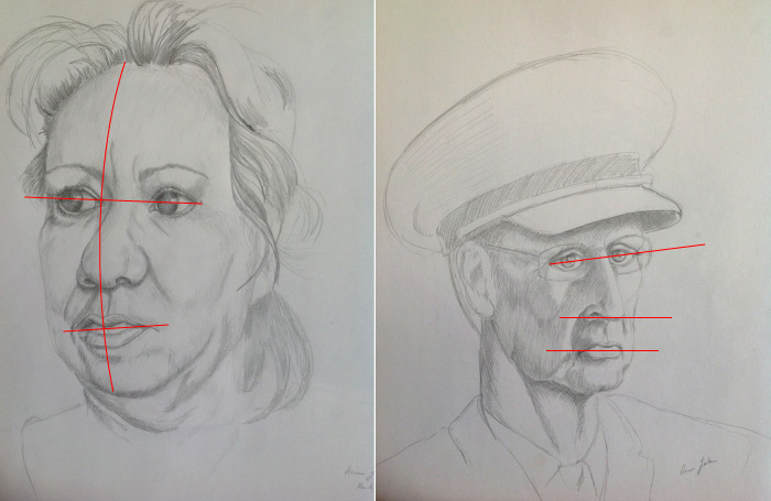
On your drawings they do not look parallel; there’s a bit of “reverse perspective” on these drawings.
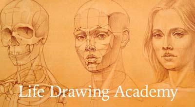
I would advise you to refer to the Drawing Academy lessons 5, 6, 7, 8, 9, 11, 13, and 14 for the necessary information and additional explanations on the subject of constructive head drawing.
I have provided a step-by-step sequence on how to draw a human head constructively in the “Assignment 7 – Constructive drawing of a human head”, which can be found on the Student Dashboard. Please login to your Drawing Academy account and download this document.
Head anatomy
This is the “must know” subject for any figurative fine artist. Confidence in portrait drawing comes from the knowledge of the head’s anatomy.
In your portraits, I have a feeling that the question of how the head and neck are connected to the body is not answered.
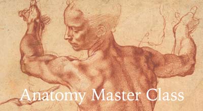
The anatomy of the head is explained in the human skull anatomy and the head muscles video lessons.
Head proportions
There are some proportions that are off here. For example, the distance between the base of the chin and the root of the nose should be the same as the distance between the root of the nose and the brow line, and the distance between the brow line and the hair line.
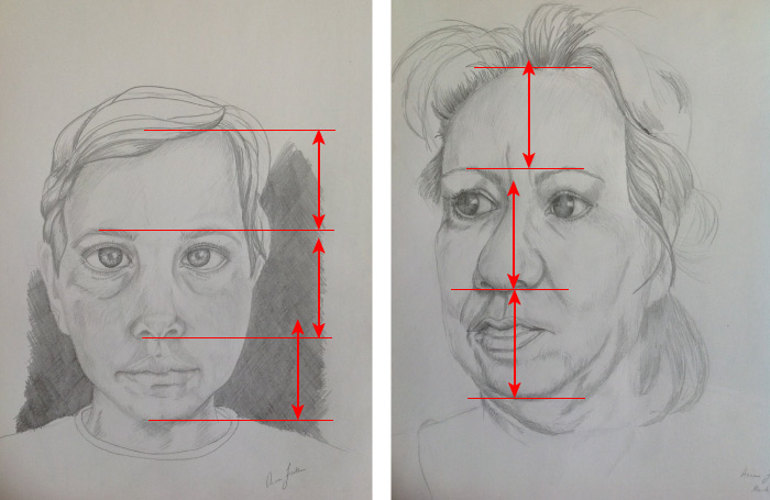
This is not quite the case in your portraits.
Facial features
There are some rules you need to know when drawing facial features. Eyes, nose, mouth, and ears have certain three-dimensional shapes and proportions.
This subject is described in-depth in the first month of the Drawing Academy course »
Tonal rendering
You have confident pencil strokes, which is very good. But sometimes it is better to understate some lines than over-pronounce them.
Think of the head as a ball. It will have three main groups of tonal values – the light, mid-tones and dark values. It is hard to tell on your portraits where the light is coming from.
Please refer to “Assignment 4 – Rendering tonal values” available on your Drawing Academy dashboard for tips on how to improve your rendering of tonal values.
Kind regards,
Vladimir London
Drawing Academy Founder and Tutor

Thank you. That makes so much sense. I couldn’t see it myself.
Anna, thank you for submitting your work. I too am currently watching and working on the human head assignments found in the month one course. Having Vladimir point out some of the weaker areas of your drawings were of a great help to me. As they say you learn from your mistakes. I like your style and with time as you work on the principles this course is teaching you are going to turn out some some really good portrait work. Happy drawing!