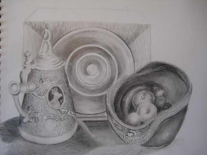
Artwork by Steve Smith, Drawing Academy student
Here, deep in the Kentucky foothills of the Appellations, a unique craftsperson turns guards into lovely bowls, adorned with cords of braided pine needles, small beads, and polished stone.
I chose the guard bowl to accompany an old art deco radio, a stein that came from my late fathers collection, and the draped yardage of some lovely lace curtain material, made in Czechoslovakia.
I assembled this group of objects, in the setting of a still life, for several reasons. I imagined that the fluid natural tones and lines of the guard would contrast appealingly the ridged symmetry of the radio. I imagined the stein would feel cold to the eyes, while the radio mixed warm and cold, and the guard warm less the jeweled beads and agate. I imagined the line of the guard leading away and back to the radio, obviously centered. I imagined the echo of the radio’s wood grain against the similar grain of the stein. I imagined, (or estimated) the hours of work it would take to render a study in pencil, encouraged and challenged by the video I had watched on the Drawing Academy website.

I used the natural light of a central area in our home, it is indirect, but relative to the subject was from the rear of me and above me. The wooden radio cabinet is as much a singular art object as the spun brass speaker, the cast stein lid, the crockery, or the bowl. The more you look at any one of these objects, the more you see, thus the concept of study. I added fruit to the bowl, and draped the lace curtain to bond the setting on the surface below them all, as much to consider how I would ever suggest the intricacy and delicacy of the fabric, with my pencils. I dove into the project with a 6h pencil, hesitantly sketching both what I saw and what I thought I was seeing. One goal was to try to avoid erasing. I had an idea that the work would evolve for better or for worse, as in doing I discovered.
Eventually I moved from the 6H to an HB, then a 2b, and finely a 6b, keeping a sharp point, and using the softer pencils, still with a light hand, to deepen the tones I felt and saw in the soft infused light of the warm room. I held back on a few white areas, as I would a watercolor, knowing that in the end I would like the piece to sparkle with the highlights I saw on the foremost tangents of the many, many, spherical planes that composed the arrangement. I moved my efforts around the work, bringing each object, and the various tones from light to dark as a whole. I masked the areas of the work that fell under my hand, using a piece of paper, as I positioned the paper field to make it easier to hatch, trying not to smudge the work already done. Our family kitten left a couple of reminding prints in between my many drawing sessions though.
The drapery was nearly the last element of the drawing that I attempted. I considered erasing when after several attempts to bring some resemblance of the fabric failed; I was still determined to find a way to suggest the weave, the repeating circular embellishments, or one or two of the butterflies that seem to float above the fabric. As I struggled with the shades, searching for a technique, I considered the addition of color, thought of toned paper, and paint. I could see the splashed of impasto sparkling in the light, imagined blending gold tones, greys, ochre, and blue. As much I thought of the task of rendering these black and white tones with pen, and my neck stiffened to think of the added hours, as well the stress of exacting hand coordination, that I could see I was far from having developed as yet.
As I neared the stage of the drawing I am in now, a few problems surfaced. I decided they were too major to be corrected. I had bought the viewpoint up from the horizontal surface of the table, allowing a better look at the inside of the bowl. I realized too late that the base of the stein was set too close to the radio. I bought the drapery up behind the stein to attempt to bring it forward, and to separate the radio from from the stein. I even considered elongating the stein downward to give the appearance that it was forward more from the radio. Another problem I toiled with was my goal to render the drawing with decisive patterns of hatching. I engaged the inside of the bowl with intentional segments of multidirectional parallel hatching, and tried to deliver tone value by use of the different pencils as well as thinning the spacing between hatch marks when I wanted darker values. In the process of this study I ended up combining the segments and allowed them to intersect each other, my eye seeing the blending of value and creating the illusion of a curved surface. In the end, I was not able to deliver the illusion of the interior of the bowl with the simplest of hatching I had hoped, and the overall value of the bowl became much darker than I had anticipated. Against the dark background, the effect of the fruit highlighted by the chiaroscuro was rewarding, I have always enjoyed these sharp contrasts. The fruit ends up miss-positioned as well. Even from an elevated viewpoint, looking down into the bowl, the fruit is unrealistically offset the center of gravity, in perspective it is not seen in what would naturally be a balance in the bowl. I took the fruit from memory, so next time Ill study the bowl with real fruit inside it.
I intend to rest my hand and eyes before starting further work to continue this drawing, to start another, or before any consideration of silverpoint, or any other medium. I have several questions to answer. First, I intend to consider other arrangements of the same objects, finding other compositions or refining this one. Second, I hope to deliver the effect best suited for the subject, improving the techniques for hatching, finding opportunities that may not have occurred to me as yet. Third, I want to incorporate an accurate rendering of the lace curtain, somehow, but at this point I have little idea of how I can technically accomplish this. It has also occurred to me that I want to avoid making the work illustrative. There is a fine line between illustrative work and fine art, both of equal merit considering the skills required, and the appeal of the final product, but in my mind the fine art has in it an emotional aspect, shared through the alchemy of the delivery.