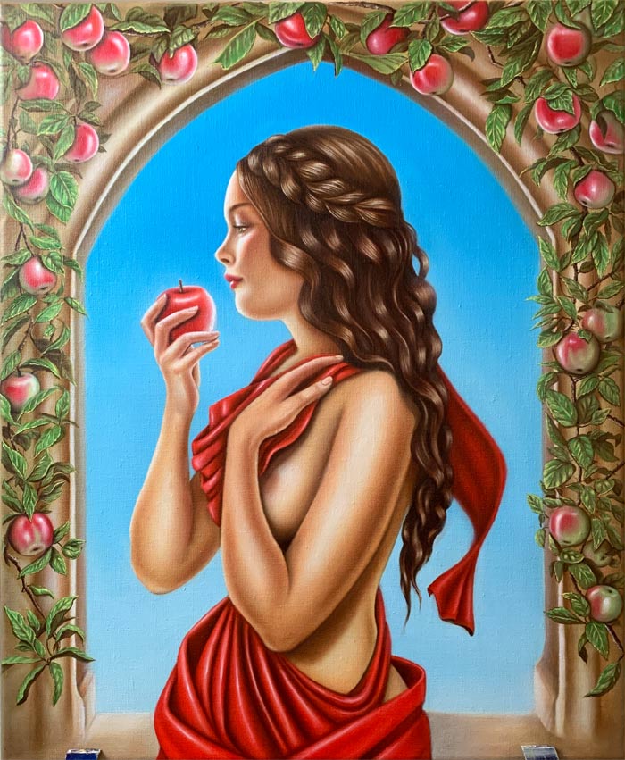
Artwork by Jasmin, Drawing Academy student
I’ve painted this portrait, but I am not happy with it. I was hoping you could share your opinion with me.
What should I have done differently to make it more visually interesting? I feel like the composition and technique have issues but I can’t put my finger on what’s wrong.
Thank you so much in advance!
Kind regards,
Jasmin
Dear Jasmin,
Thank you for your beautiful portrait composition; what a wonderful painting! Many art students would love to have your skills and talents.
I really like your artwork and there are not many things I would do differently. Some points below are just my personal opinion and you do not have to correct your painting. Some corrections are not possible at this stage, but also, as an artist, you can have different preferences.
To begin with, I would compose such an artwork a bit differently, giving more “nose room” by shifting the whole figure slightly to the right. This would put model’s eyes into the central point of this composition rather than her ear area. There are 15 elements of composition you may or may not be aware of. The knowledge of these elements helps to compose artworks that tell a story and evoke emotions.
There model’s face is beautiful, yet at the same time, making her chin less heavy might make this portrait even more attractive.
The frontal bone of the skull can be a little bit higher at the top; it would result in more natural angle of the cranium’s dome. The way to check where the top of the head should be is by measuring the distance from the line of eyes to the chin and then applying the same measurement from the eyes to the joint between the frontal and parietal bones of the skull.
Two forearms need improvement. The arm bones are in the supinated position, which should give characteristic planes and outlines. In real life, they won’t looks so perfectly round. Knowing the arm’s anatomy greatly helps to avoid such mistakes. This applies not only to shapes and position of bones, but also to origins and insertions of muscles. We do not see bones in life, yet outlines of muscles point to places where they connect to bones. If such points are misplaced, the drawing would not look realistic.
Apart of composition, proportions and anatomy, I can also briefly mention the chiaroscuro and use of colors. The direction of light is doubtful because highlights are located all over the place as if different sources of light are used for every body part; there is no unity in this respect. I know it is very tempting to work on highlights to make the figure more three-dimensional, but you should not forget about the overall shape of the body. Highlight wold not have the same intensity in every place.
Also, as an artist, you need to decide what the focal point of your composition is, and work on the chiaroscuro to deliver this message. In your artwork, you paid equal attention to every highlight and shadow so every detail, including each apple is important.
The same applies to the drapery folds. When it comes to depicting draperies and clothes, an artist has to keep in mind that the purpose of folds is to describe the body underneath. In your painting, every fold has equally dark shadow, which makes it rather repetitive and non-descriptive as if every fold is there to tell about itself, not the form it covers.
The way you indicate shadows can be improved. For example, every shadow on the apple under each finger is the same, which makes this apple flat. However, the lack of shadows beneath apples on the background creates an illusion as if it is a flat decoration painted on the wall.
Talking of colors, you follow the style of the Renaissance artists who used open, similar temperature colors for illustrating one object. The modern color theory tells us that in every warm object, there will be some cold colors and vice versa, in every cold object or area you may find warm colors. The red drapery has only red color and its shades and tints without any cold reflected light, which should be plenty of because the sky is clear and blue. If this was done on purpose, then it is your call as an artist; however, if this happened because of lack of knowledge, then learning the rules of color theory will help you to expand your creativity further.
Because it is impossible to cover every single point and the theory behind it in this feedback, I will give you one great advise on how to improve your art skills.
If you want to learn strong drawing skills, there is one course that will be especially helpful – Life Drawing Academy. This academy comes with the Correspondence Course, which is truly unique. In the Correspondence Course, your current level of art skills will be assessed and a special curriculum will be created just for you. You will get a dedicated team of art tutors, who will provide unlimited personal tutoring, so you could study at your own pace in the comfort of your home for as long as it takes to get the advanced level of drawing skills. In this course, you can learn all you need to know about constructive drawing, tonal rendering, linear and aerial perspective, rules of composition, golden proportions, know-how of architectural drawing, classical canons of human head and body proportions, its anatomy and construction, character design, gesture sketching, portrait and figure drawing, drawing draperies and folds, animal drawing, interior and exterior drawing, landscape, still-life, and genre drawing, and so on. Because your personal curriculum will be designed around things you want to learn, you will receive very special learning experience. Nowhere else you would get such tutoring that is based on classical traditions of proper art education that is no longer available at contemporary art colleges. And the good thing is – because we take a limited number of students to test this course, it is available for a very low one-time fee. When all places are filled, we will suspend enrollment, or raise the price to its real value of $15,000.
To fully benefit from this course, enroll today:
https://lifedrawing.academy/pricing
To your creative success,
Vladimir London
Art tutor
Thank you very much for this critique. You gave me a lot to think about and every point you made is very valuable to me. Instinctively I knew that the elements aren’t quite right but my imagination had reached its limit and it is because of the gaps in my knowledge.
I’m very excited to work on the points that you so kindly mentioned!
I hope it will be possible for me to enroll in the Life Drawing Academy in the near future!
Thank you again! I really appreciate your feedback!
All the best!