Discover What is Calligraphy
In this video lesson, you will discover What is Calligraphy and how calligraphic writing can improve your art skills.
Enroll in the Drawing Academy Course
Pay once - Enjoy forever!
Only $297
What is Calligraphy
When it comes to the question “What is Calligraphy“, a fine artist must know that this term defines the decorative handwriting or handwritten lettering as well as decorative elements drawing. Calligraphy can be created with a pen or brush.
This “What is Calligraphy” video lesson continues with calligraphic swirls in black ink. For this task you can use a metal nib ‘Leonardt’ size 2 ½.
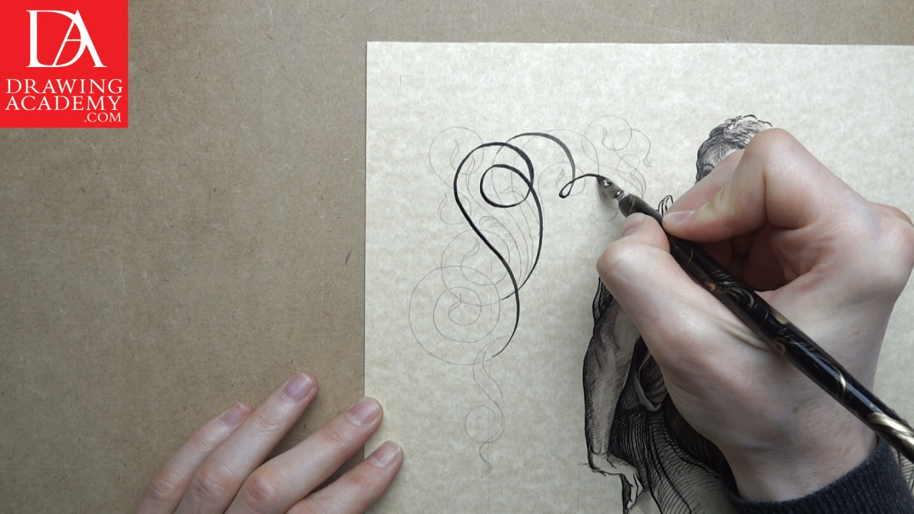
Considering ‘What is Calligraphy’ and how it can be done, ideally, in handwritten calligraphy, the swirl’s line should be drawn in a single smooth movement. In this “What is Calligraphy” lesson, I’m doing calligraphic lines in a slow constant-speed movement. A good result will depend on many factors, such as the quality of the ink, the metal nib, the paper, and the drawing skills and ability required to make the steady confident lines, with a smooth and fluid movement of your fingers and hand.
Once again, when it comes to the topic of “What is Calligraphy” and how to hold a pen for calligraphic drawing, I have to stress the importance of employing the correct pen grip in handwritten calligraphy. Make sure you hold the pen with your two fingers and thumb, and its shaft must be pointing directly towards your shoulder. The movement of the pen is achieved by both contracting and extending your fingers and thumb, as well as the movement of your hand.
Unlike using a sharply pointed nib, where the thickness of the line depends on the pressure on the pen, using a metal nib does not require changes in pressure to vary the thickness of the lines. The thickness of the line in handwritten calligraphy depends on its direction.
You may notice in this “What is Calligraphy” video that in handwritten calligraphy the line becomes thicker when it goes downward in a top-left to bottom-right direction, and becomes slimmer when the movement changes from the top-right to the bottom-left.
It is easier to do circular calligraphic lines in two parts when you work with a metal nib. First, you start from the top of the line and go down to the bottom, making a semi-circle or curved line. Then, you lift the pen and come back to the top starting point of the line, and continue the downward movement on the remaining half of the semi-circle. In handwritten calligraphy you should not attempt to push the pen upwards on the paper. Lines should be drawn in smooth downward strokes.
It takes a bit of practice to load the nib with the necessary amount of ink. Loading too little ink would end up in you running out of it half-way through the line; loading it with too much ink might end up with uncontrolled ink-flow on the paper, which is even more risky, as you may spoil the drawing.
Handwritten Calligraphy in Gothic Style
We now start writing the name “Vitruvius” in gothic handwriting style. There are many rules and tips for this kind of handwritten calligraphy. This handwritten calligraphy artwork is inspired by the ancient Roman writer, architect, and engineer, Marcus Vitruvius, and his book “De Architectura”. Marcus Vitruvius lived more than 2000 years ago, and he has become well known for his book, in which he describes three principles of architecture, known today as “the Vitruvian Triad”. These three qualities require architecture to be solid, useful, and beautiful. In his book, he sets the rules for the proportions that humans perceive as beautiful.
I’m writing the Latin passage from “Vitruvian book number 3”, which states the observation of proportions. This quotation roughly translates as: “If Nature, therefore, has made the human body so that the different members of it are measures of the whole, so the ancients have, with great propriety, determined that in all perfect works, each part should be some aliquot part of the whole;”
Vitruvius had defined his ideally proportioned “Vitruvian Man”, which was later drawn by Leonardo da Vinci. This man is inscribed inside the square and the circle, and the human body proportions are described both in the Vitruvian book, and on Leonardo’s drawing.
Vitruvius is defined today as an architect; however, during his time architecture was a much wider field than it is today. It included architecture itself, engineering, art, landscape architecture, and craftsmanship.
This handwritten calligraphy is done in black ink. Writing in brown ink can be inconsistent in tone in some cases.

Comments are closed.