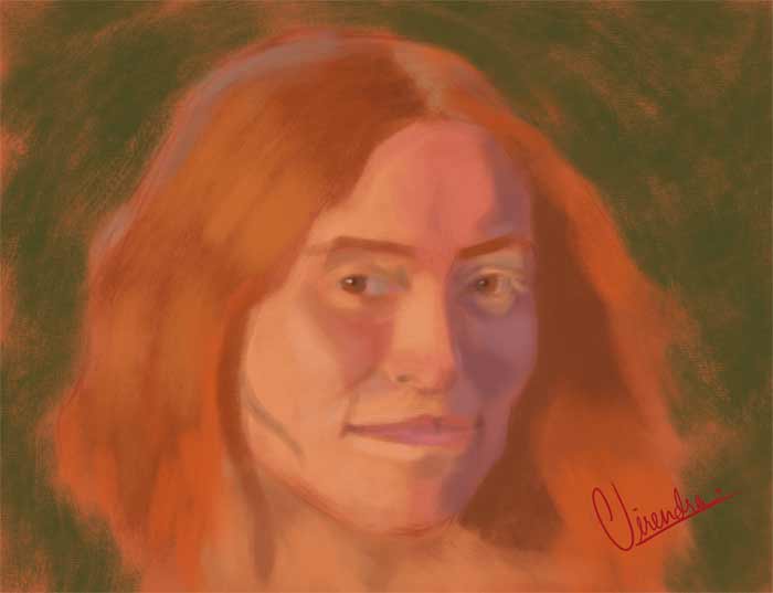
Virendra’s Portrait Drawing Progress
Virendra joined the Drawing Academy course after winning membership in our online art competition. Since then, he has continued developing his drawing and painting skills and working on portraiture.
Here is what Virendra Chhura says about her latest portrait:
“This is a recent portrait study done by me. I admit that the previous painting I sent seemed a bit chalky, as you pointed out. Does this portrait have the same problem? Also, what flaws do you see in this portrait, and what do I need to improve?”
Feedback from Vladimir London, a Drawing Academy tutor:
Dear Virendra,
Thank you for sharing your latest portrait study.
I like this portrait very much. It has personality and character, and I am certain that it also captures a good likeness of the model. This is very important in portraiture because a successful portrait is not simply a collection of correctly drawn facial features; it should also convey something individual about the person.
The colors are pleasing and harmonious, and I do not see the same chalkiness that concerned you in your previous work. The skin tones look more natural and unified. The proportions of the face are convincing, and so is the construction of the head. You have a good understanding of the three-dimensional form, and the facial features sit well within the overall structure.
There are, of course, always things that can be explored further. The difference between the light and dark tonal values could perhaps be a little greater. Increasing the tonal contrast in selected areas could give the head more volume and make the portrait appear even more three-dimensional. However, I would not call the current tonal range a fault. If the softer chiaroscuro was an intentional artistic choice, then it works perfectly well. Not every portrait needs dramatic contrasts of light and shade. The tonal solution should support the mood and character you want to convey.
One point I would consider is the layout of the portrait within the picture plane. For a head portrait like this, a vertical format might work slightly better than a horizontal one. It could give the figure more space in the direction of the body and create a more natural relationship between the portrait and the edges of the composition. Nevertheless, this is also a matter of creative choice rather than a strict rule. If the horizontal format was chosen deliberately as part of your composition, there is nothing wrong with using it.
When working on your next portraits, continue paying close attention to the construction of the head, the relationships between facial features, and the overall tonal balance before concentrating on smaller details. A strong portrait depends on the big forms first. When the proportions, construction, and tonal relationships are convincing, details can be added without losing the unity of the portrait.
It is great to see that you continue working on portraiture. Your skills are improving, and this painting shows good progress. Keep practicing, observing, and experimenting. Every new portrait will strengthen your understanding of the human head and help you develop greater confidence in your own artistic decisions.
Well done, Virendra. I look forward to seeing your next artwork.
Vladimir London
Drawing Academy tutor
To learn anatomy for artists, take the Anatomy Master Class »
To learn professional drawing techniques,
Enroll in the Drawing Academy Course
Pay once - Enjoy forever!
Only $297