How to Draw a Scenery Using Composition Rules
Video Lesson Description
In this video lesson you will discover How to Draw a Scenery using various rules of drawing composition.
Drawing Lesson 26, Part 6 – 2nd Part

How to Draw a Scenery – Composition Proportions
When it comes to the subject of “How to Draw a Scenery” various rules of composition shall be considered. This drawing follows several important rules of proportion, which makes the composition look natural and well-balanced.
Another composition rule we can apply in this “How to Draw a Scenery” lesson is the Rule of Rabatment. Placing a square in the left part of the picture, we get the inside left rabatment and the outside left rabatment. The left rabatment splits the picture in two parts. Town and trees in the middle are located inside the square; rocks with architectural ruins – together with trees in the foreground – are in the outside rabatment.
When considering how to draw a scenery, a fine artist can also apply the rule of abatement’s diagonals. This rule says that rabatment diagonals can be used as direction for the main lines of the composition and its intersection as a focal point that attracts attention.
The intersection of the left rabatment’s diagonals points directly into the group of buildings; thus, pulling the viewer’s gaze toward the small town in the background.
The right rabatment’s diagonals are also coinciding with the elements of the drawing. Check how the middle trees’ foliage goes down along the diagonal line. The left edges of the trees match with the left side of the square. Another diagonal goes along the outline of the bushes, under trees and through the point where the tree trunk meets the bush. This diagonal also matches the freeze above columns and then points into the place where the tree branch grows from the tree trunk and goes along another branch.
The artwork composition balance plays an important part in artwork. Balance in drawing depends on how objects are arranged in relation to each other and how heavy or light they look.
In this “How to draw a scenery” video lesson, the landscape has three main groups – a small town, trees and bushes in the middle, and the rock with ruins together with foreground trees and boulders. The groups become bigger and darker from left to right. The town is the lightest and smallest, while the rock with ruins and trees is the biggest and darkest group. This creates a special rhythm from small to big objects with pauses in between. The group with the rocks is considered to be the heaviest. To keep the picture balanced, much more space is dedicated for the remaining two groups. Since the town and middle trees are taking up more space on the drawing, the composition looks well balanced.
Balance does not necessarily mean symmetry. While middle trees can act as the axis, the two groups on the side are not equal in size and weight. The rock is positioned closer to the right drawing edge, while the town is farther away from the left edge of the drawing. Such balance is called, the Dynamic Balance.
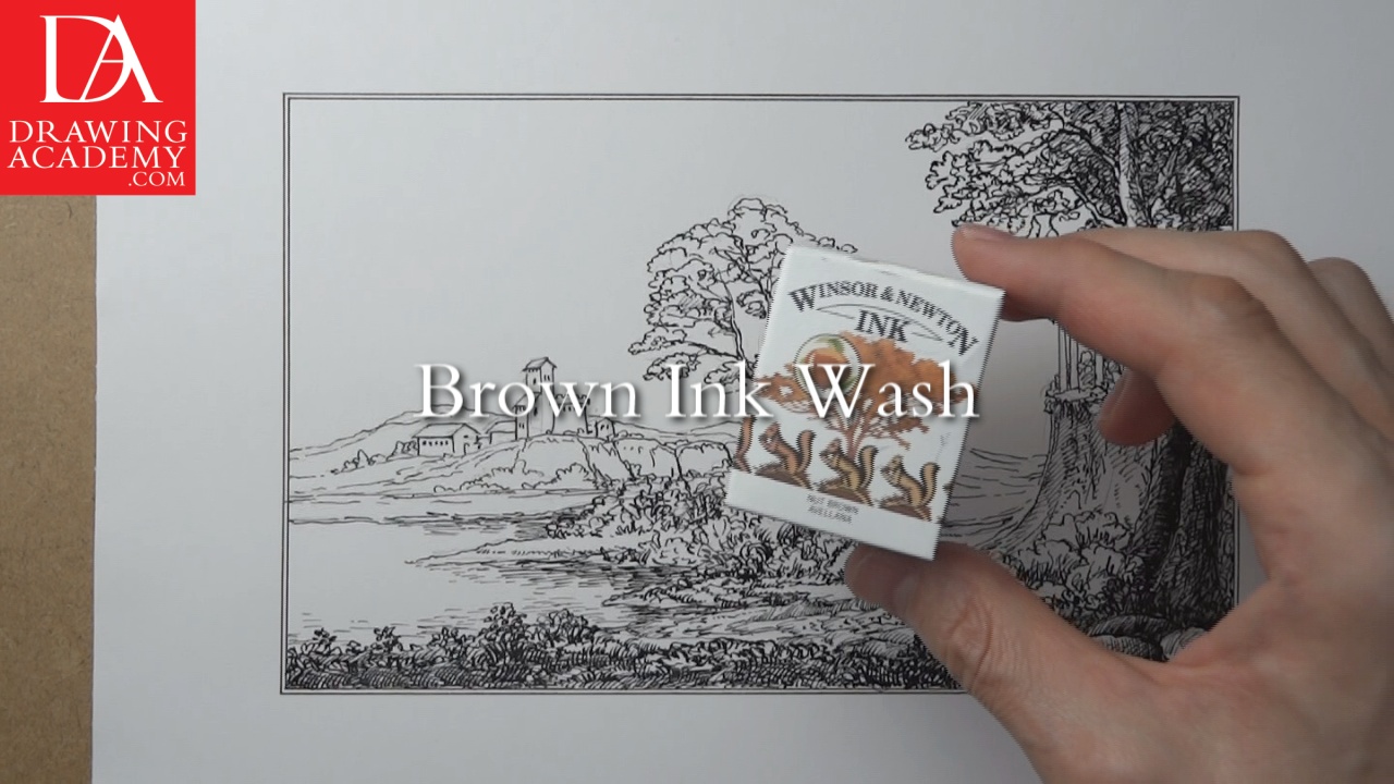
How to draw a scenery – Brown Ink Wash
This artwork is finished in a brown ink wash. For that purpose, Windsor & Newton’s Nut Brown Ink is used. This ink contains shellac.
The brown ink dilutes black ink lines and mixes with black ink, producing a dark, grey-brown tint. This is similar to sepia colours in appearance. Brown ink can be easily diluted with water to make it less saturated. Diluted ink gives lighter tones.
A brown ink wash not only gives a sepia tint to the drawing, it is also unifies visually separated black ink strokes.
Original sepia has a dark, brown-grey colour; it is made from the ink of the common cuttlefish in Sepia. As an artistic media, sepia was used from ancient times to the 19th century. It was known as writing ink during Greco-Roman civilisations.
Due to its ancient origin, today sepia is associated with the Old Masters’ art. That is why I want to tint this Italian style landscape in sepia colours.
- Receive 15 new videos monthly (45 in total)
- Incredible discount – $4,164
- Bonuses - Fine Art eBooks and Videos
- Drawing Academy Diploma of Excellence after course completion in 3 months
- Personal coaching by Drawing Academy Tutors
- Lifetime membership. Free after the 3rd month

- Immediate access to all 45 video lessons
- Incredible discount – $4,198
- Bonuses - Fine Art eBooks and Videos
- Drawing Academy Diploma of Excellence after course completion in 3 months
- Personal coaching by Drawing Academy Tutors
- Lifetime membership. No more payments