How to Draw a Portrait – Part 3
In this video lesson you will discover How to Draw Female Face using traditional drawing techniques.
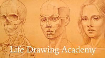
Enroll in the Drawing Academy Course
Pay once - Enjoy forever!
Only $297
How to Draw Female Face
We are continuing to draw the Thalia’s portrait, steadily rendering shades on her chin, cheek, and lower under-plane of the jaw in delicate and short pencil strokes.
Longer strokes are used for the hair. As Thalia’s hair and ivy wreath is the secondary part of the drawing, I want to render these parts with fewer details. Longer pencil strokes unite those areas.
So far less attention was given to the hair and the top of the head appears less rendered than the face. I am using the cross-hatching technique, rendering hair layer by layer. The pressure on the pencil is very light. You may see that about three and a half inches of the pencil is extended out of my hand.
Accurate shorter lines are required for the areas with higher contrast between light and shade. The highest contrast is where the head is the closest to the light source. The light is coming straight from above, casting deep shadows on the forehead, under eyebrows and behind the nose. The greatest contrast is between well-lit ivy leaves above the forehead and cast shadows under those leaves.
In cases when more pressure is required to make deeper and stronger lines, I am changing the way the pencil is held. You may see that much less of the pencil is exposed from my hand; now only about an inch of the pencil sticks out. The angle between the pencil, and the paper is slightly greater than previously.
The darker grade pencil is used when even more deepening of the tonal values is required. This pencil gives softer, less defined lines and best to be used in secondary areas like hair and floral decoration. For the foreground, which is the face, it is better to keep clear lines of well-sharpened harder grade pencil. This method will give the tonal perspective effect, when foreground lines are sharp and well defined, while background lines are soft and hazy as if being out of focus.
The background on the right hand side of the drawing needs to be darkened up. I am shading it with long parallel strokes that overlap slightly the right edge of the hairstyle. The shading lines start on the hair with a little pressure on the pencil, then I am increasing the pressure and finally lifting up the pencil to start another line next to the previous one in the same manner. Pencil strokes go from bottom-left to top-right direction. Every line is clearly visible, contributing to the overall decorative effect of the background. Every layer of shading is quite light, multiple layers will give deeper background value.
Many students ask me what pencils they should have. Graphite pencils are made from powdered graphite mixed with clay. The quality of graphite and the mix ratio gives various grades of softness. It is not necessary to buy the whole range of grades. Just a few pencils will serve you well. Your small selection could include HB, B, and 2B or 3B pencils. Go for a reputable brand. The price would still be very much affordable for only three pencils, but you will get a better consistency of the pencil core, which gives a very regular tone. Good quality pencils break less.
Choose a wood-cased artist’s quality pencils. Drawing with pencils that have a honeycomb shape cross-section are much more pleasing than with round ones. Wooden ridges give extra grip and control over a pencil.
Graphite is also available in square sticks or cylindrical woodless pencils with a layer of lacquer for clean handling. Such drawing tools would not be required for the Drawing Art Academy lessons. With time you may find a particular application for graphite sticks, for example making a monumental drawing on a wall, where a small pencil would not be enough. However, for the purpose of developing your drawing skills at the Drawing Art Academy, standard wooden-cased pencils are your best drawing graphite tools.
Mechanical and clutch pencils are great for mechanical drawing, transferring sketch outlines, illustration and other tasks when uniformed line with constant thickness is required. In the drawing Art Academy I will you few applications of the mechanical pencil; nevertheless for the purpose of traditional drawing as we do right now, mechanical pencils would be the wrong choice.
Did you know that a standard pencil, which is only 18 centimetres (or 7 inches) long, could draw a line 55 kilometres (or 34 miles) long?
With regard to erasers, there is a common misconception that professional fine artists do not use them. That is not correct. In fact erasers are sometimes used not only for erasing mistakes or redundant lines, but also can be applied as a drawing tool, for example making soft highlights or lighter lines on a toned background.
Two erasers would serve most of your needs – a white plastic eraser and a kneadable one. The pink and blue erasers are not suitable; they are too abrasive and will damage the paper.
The white plastic eraser should be used with caution as it can also damage a soft paper. It works well on smooth, hard surfaces.
The kneadable eraser is the most appropriate tool for erasing graphite on fine drawings. It picks particles of graphite without smudging. You should stretch and fold it to get a clean surface. The point can be squished to form a tip for erasing small details. Use a dabbing or twisting motion for best results when using a kneadable eraser. This eraser is washable, should you collect too much of graphite or charcoal dust.
I am drawing this portrait standing next to the upright easel with the drawing board tilted about 15 degrees from the vertical position. My right hand is not touching the paper so no protective sheet of paper is required to protect the drawing from smudging by hand.
The grip I am employing to hold the pencil serves me well in this position. My hand is extended further forward than I would be able to do otherwise. This gives me a good view of the drawing, not too close to lose appreciation of the whole artwork and not too far away to lose focus on small details.
For small details, I can change the way the pencil is held. Holding the pencil with three fingers changes the position of my hand and distance to the easel. Now I’m closer to the drawing and my hand is touching the paper, so a protective sheet of clean paper is placed between my hand and the drawing to protect it from smudging.
I heard from one American fine artist and illustrator that standing and holding the hand in the air is very hard for him. I respect that every individual has his or her preferences and physical abilities.
The sitting position is also good for drawing. If you draw from life, it is better to have your easel upright, so you have a good view of the subject, as well as the drawing at the same time, and can compare them to each other without lifting or rotating your head too much. This would also give you an opportunity to use the correct pencil grip.
However, when you do illustration or work from a photo or preliminary sketch, then your easel can be tilted 45 degree and your hand can be rested on the paper. In this case, you may place a clean sheet of paper between the drawing and your hand to protect the artwork from smudging. The pencil grip should also be altered for this easel position.
Let us to come back to the drawing.
The tonal values are progressing steadily. The darker background compliments a white marble of the sculpture. The diagonal direction of pencil strokes on the background creates an artistic effect and gives a bit of dynamism to the artwork.
My purpose for this artwork is not to achieve a hyper-realistic illusion of the reality, but re-interpret the portrayed 3-dimensional marble head into a 2-dimensional drawing. The personal touch of the artist is required for this task. Every fine artist has his or her own unique style and that is what counts in art.
We are continuing to render shading, darkening tonal volumes to the desired level. As previously, I am not aiming to finish any particular part of the drawing first. Instead, I shade little by little all areas of the drawing one after another. This approach helps me in two ways. First, I have the greater control over tonal values, developing the drawing to the desired tone without over-stretching the value to not achievable by my pencil. And the second, constantly changing my focus from area to area, I am keeping perception of the drawing fresh, without getting used to one particular element of the drawing. This helps me constantly compare tonal values of various drawing parts to each other.
It is better to stop drawing just before you think the artwork is finished, keeping it fresh, than overdoing. Human perception of the fine artwork is such that our brain tends to work out some uncompleted elements of the picture and finds slightly unfinished artworks very attractive.
Here is the completed drawing of the classical female head in graphite on paper.
Great art starts with a great drawing.