Drawing in Ink – Rendering a Sphere in Black Ink
In this video lesson, you will discover how to make a Drawing in Ink by rendering shades.
Enroll in the Drawing Academy Course
Pay once - Enjoy forever!
Only $297
Drawing a Sphere in Black Ink
We begin this Drawing in Ink artwork with a quick sketch, in pencil, of a circle that represents the outer contour of the sphere.
The Leonardt England metal nib, fixed in a penholder, will be used for drawing in ink. I will make a few strokes to test how lines done with this pen look. The direction of lines goes along the sphere shape.
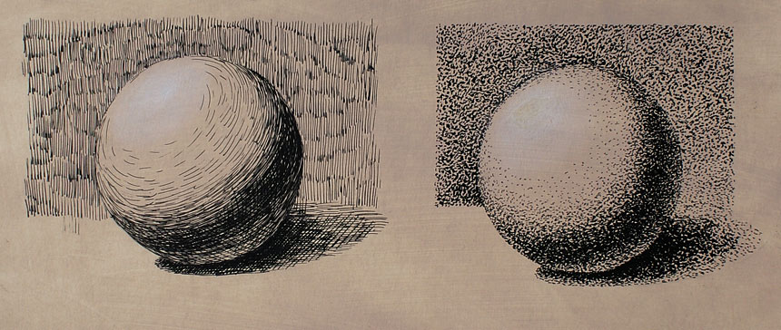
This drawing in ink has a classical illumination; the sphere is lit by the source of light radiating from the top-left corner.
I do short and slightly curved lines along the border between light and shade.
To the right of this border is the Core Shadow, which is the darkest place on the sphere because the least amount of light reaches this place. As this place is the darkest on the sphere, it is makes the most sense to start from this area.
Drawing in ink has some specific characteristics compared to drawing in pencil. First, the line is always black. Changing the pressure on the pen will only result in varying the line width, not the line tone. Second, black ink is very hard to erase.
Keeping these two points in mind, we need to adjust our drawing habits. Starting from the darkest areas of a drawing helps to establish how much rendering is required to achieve this dark tone.
All other tones will be kept lighter by applying less rendering or using an alternative rendering method that produces a lighter tone.
All black ink rendering must be pre-determined before attempting any shading. As the erasing of black ink is a challenging task, it is better to avoid it altogether.
Drawing in ink is similar to graphite drawing; in the respect that, white paper is left un-rendered to represent the lights; only shaded parts of objects are being rendered in ink.
In this drawing in ink, the background is darker than the light area of the sphere. To illustrate the contrast between the sphere and background, I render the background in short, vertical pen strokes. The background has a unified tone that differs very little in various areas. The texture of vertical strokes visually separates the surface of the sphere from the area around it.
The sphere is placed on a flat horizontal surface, in this drawing in ink. The spot right under the sphere is the darkest place on this drawing. This area of shade is called The Accent. The accent has the least amount of light reaching from the light source. It also has no reflected light affecting its tonal value. Despite being the darkest place, it doesn’t mean we can go pitch-black there. The pen strokes still have gaps between them. Of course, the density of lines is higher and line thickness is wider. This makes the accent look darker. For the tabletop rendering, I am using horizontal strokes.
The casted shadow has an oval shape, as it is the projection of the sphere on the flat surface. In this drawing in ink, within this oval, we can distinguish two areas of the shadow. The one that is closer to the sphere is darker in tone and the other is like a halo, it goes around the first one and is lighter in tone. This change in tone happens because reflected and diffused light penetrates into this shade area, making the outer edge of the shadow lighter.
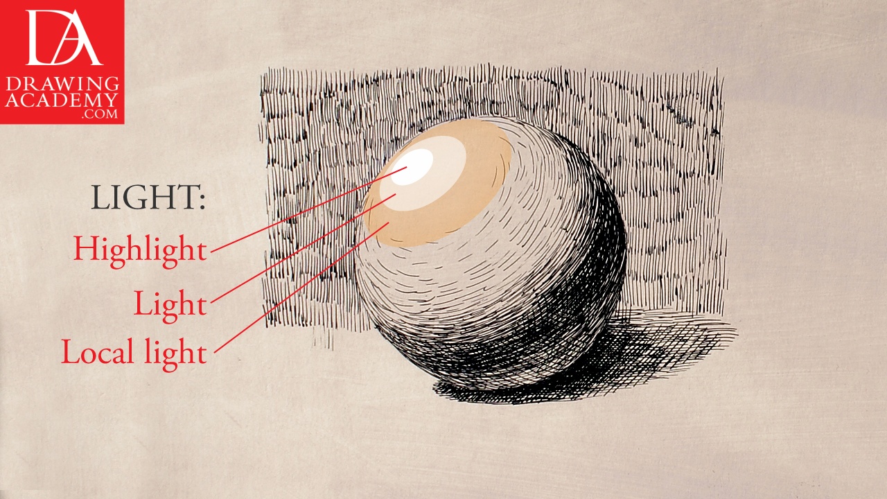
The entire drawing in ink can be divided into three distinct areas of rendering:
– Light;
– Mid-tones;
– Dark values.
The light can be subdivided into:
– Highlight;
– Light;
– Local Light.
Middle Tone values are:
– Light Halftone;
– Middle Halftone;
– Dark Halftone.
Dark values are:
– Form Shadow;
– Core Shadow;
– Accent.
In this drawing in ink video lesson we have two sketches, one is done in short line hatching and cross-hatching, and another is rendered in the Stippling drawing technique. The stippling method consists of multiple small dots placed closely to each other.
When it comes to drawing in ink using stippling method, keep in mind that the process of stippling is quite slow and laborious. Imagine replacing a single pen stroke with at least twenty dots. You probably will think twice before attempting a large-scale artwork in ink using this method.
The stippling drawing in ink is very straightforward and simple in principle. The more dots and the closer they are placed on the paper, the darker the value of tone will be. There is a mistake to watch out for, though. Placing too many dots too close to each other might form blots you definitely want to avoid. Otherwise, it is perfect for making soft gradations of tones.