The Five Essentials of Basic Painting
The things you need to know to make your paintings sing
Article from T. Stonefield
1. Focal point – What do you want your views to look at first?
The main goal of a artist is to direct the viewer’s eye through the painting and lead them toward what you think is important. Very much like a director for the stage, you use supporting actors and background to highlight the main character or focal point of your painting. Although there isn’t only one way to do this, there are tried and true strategies you can use to draw a viewer’s eye to a point of interest, as well as to create the illusion of objects, people, and places being set in space.
Many beginning artists have the tendency to spend most of their time trying to paint things as accurately as possible, but forget about the setting that the objects in their paintings are in. When first starting out, it seems that there is just too much information to process and it seems overwhelming.
When starting a scene with more than a few elements and you can’t decide what your focal point will be, it makes sense to ask yourself a few questions before picking up your paint brush.
First, you should know why you want to paint this scene? Yes, you need to have a reason!! What has attracted you to it in the first place? Was it the light playing through the trees or on across the table onto the flowers in a vase? Or was it the beautiful bright colors or softer, subtle tones? Maybe the mood of the person or scene evokes a feeling in you. What do you need to put in the painting to attract the viewer and get them to feel what you feel? As you answer these questions, you soon realize that there are many interpretations to a given scene. This is often a stumbling block for beginners. How do I do that?
The answer is easy: Start!! Then pick something that you like and put it down. Your first attempt may be disappointing, but if you continue on, you will improve fairly quickly if you hang in there.
Second, you can change the elements to suit the emotions or message you seek to share with the viewer. Again, you should feel drawn to the image and want to put it down on canvas. If a certain area of the intended scene doesn’t call to you, change locations or use different subjects. Another option is to crop the scene or focus on only one of the details in front of you.
If you have a building in the painting, have clouds or trees as supporting characters pointing (subtly of course) to your focal point.
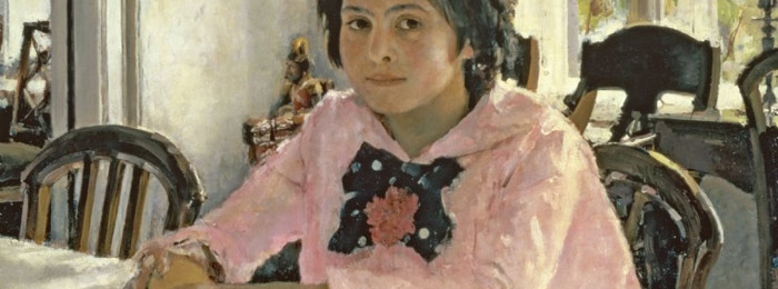
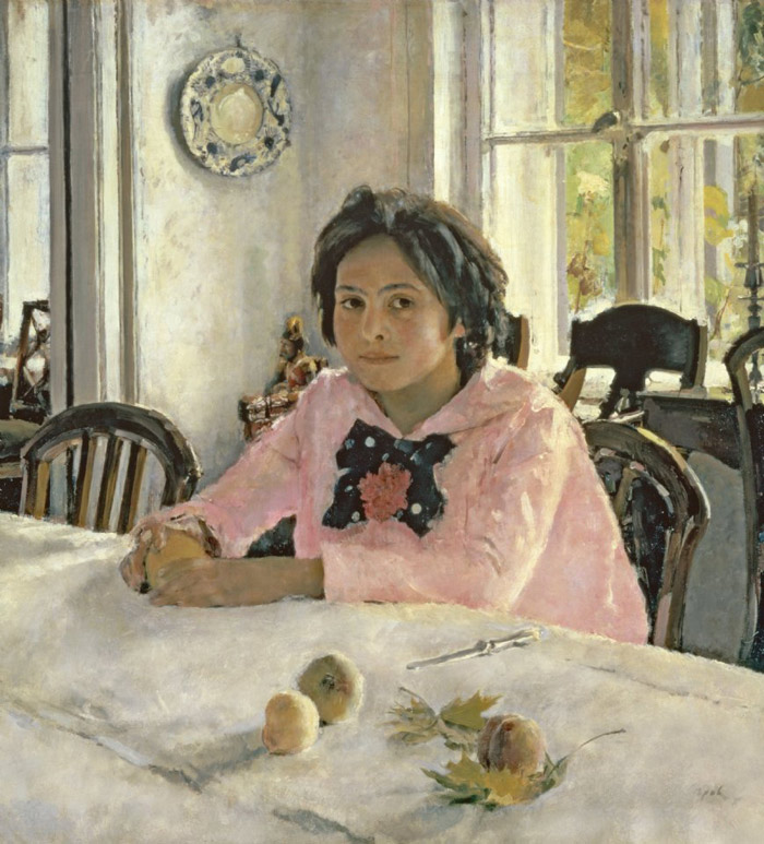
If you are planning a portrait or figure painting, the clothing and background become the secondary elements.
With a still life, it is the same. Decide which element will be your focal point. Play it up with brighter color, contrasting values, and/or bolder lines and then play down the rest of the elements using the opposite of values, color tones and less decisive edges.
Once you know the why, you need to focus on the how. You can use lines, shapes, or colors to draw the eye to the main character in your story.
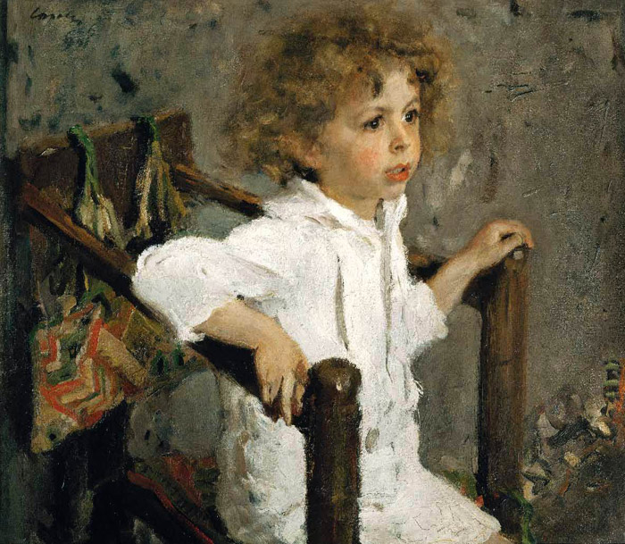
One final point to be aware of that many new painters make; don’t put your main element/character right in the center of the canvas! It’s boring and has no feeling of interest. Even a portrait should have the model slightly turned and slightly to one side or the other. If the model is looking to the right, move the position on the canvas a little to the right and vice-a-versa.
2. Composition – how to make a strong and commanding painting.
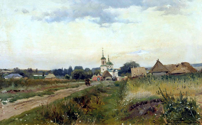
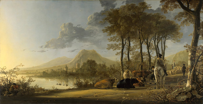
One of the simplest formulas for composition is to divide your paper or canvas into thirds, not equal thirds, but each third being slightly larger or smaller than the other two. If you are doing a landscape, think sky, background, and foreground.
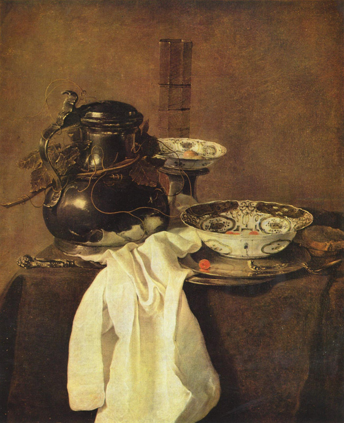
With a still life, you can think of the background, the elements: flowers, fruit, pots etc, and the foreground: table top etc.
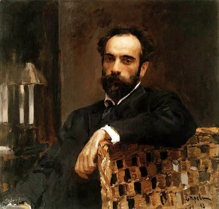
With a portrait, it’s a little different. There is the background, the face, and the rest of the body ie. clothing, hands, and anything else. After dividing the canvas into three, place the top of the head somewhere between the top of the canvas and the upper third of the space.
3. Value – Use a dark tone, middle tone, and light tone to give impact to your painting.
Again, you should try to break the painting into separate areas for each of the values. Think of a poster that can be seen from across the room. You want a painting that commands attention.
If you break up the values with lights and darks throughout the painting, the painting will be confusing and weak.
Even with a strong central focus, overuse of grays and lack of strong darks results in a weak painting. Do not be afraid of using your darkest darks, even in portraiture!
4. Edges – You don’t have to put in everything you see or how not to have a painting that looks like things are pasted on the background.
A painting is a representation of an object or figure in a setting. The figure, house, or object is part of the setting.
Beginners tend to overwork edges as they focus on each part of the painting. In actuality, as we look at something and focus on it, the areas around it are blurred, because the brain cannot take in all of the information as one. Focus on one of your fingers and you will notice that the others will fade out and blur. To make your own painting read more real, soften the areas that are not as important and that you don’t want to take center stage.
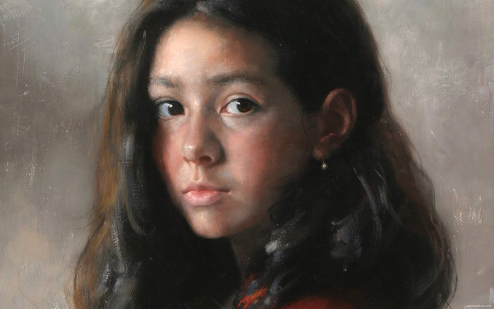
In a portrait, do not paint in all the edges and lines in the contour of the face or body. When similar values meet, leave out the border or soften it. The soft part of the neck or check will turn back more convincingly if the line is blurred. The eye fills in the rest.
Use your harder edges when there is an important area that needs to be emphasized or when you want to draw the eye to a certain place.
5. Color – Yes, sorry. There are three more things you need to think about!
a. Color value: how dark or light is each color?
b. Warm or cool: Warm colors generally come forward, while cool usually go back.
c. Bright or dull: No, colors are not graded for intelligence, but if you get this point and can use it, your pictures will have depth.
Color changes are used to express plane changes or distance. In general, the brighter, warmer, darker the color, the more it will appear to come forward.
In landscapes, the further back the objects whether they are trees, buildings or mountains, the lighter, grayer, and cooler you should paint them.
The closer the objects, the warmer, darker and brighter they are.
For portraits, the color of the skin changes according to the light. Naturally, as the face turns away, the colors are darker. Usually, indoor lighting is cool making shadows warm. The mid-tones (not in direct light or shadow) are the brightest and purest in color. When figures are outside in the warm light of the sun, it is usually the opposite, warm lights and cool darks.
The same is true with still lives.
The best practice of course is observation. Be aware of the rules, look, try to understand what you are seeing and practice, practice, practice! You will be amazed how developed your eye becomes over time.
Good luck in your journey in becoming an artist! Let us know of your progress.
excellent!!!!!!!!!!!
Great article!