Hatching in Graphite Pencil
Question from Yuri Magalhaes, Drawing Academy student
I’ve acquired the course and already I have doubts about the hatching. When doing the hatching for creating the values, do we intentionally leave a bit of space between each stroke? Or can they be so close together that no space is left between them?
I ask this because from the video it seems that the cross hatching leaves quite a bit of texture in the drawing. Is that intentional, or if I want as smooth a texture as possible, do I simply apply new layers until no white from the paper can be seen behind the hatching?
Thank you.
Yuri Magalhaes
Dear Yuri,
Many thanks for enrolling in the Drawing Academy course.
I’m glad that you are asking questions from the very beginning, it is a great way to learn.
In regard to pencil hatching, there are different methods employed by various schools.
The Old Masters left masterpieces where you can clearly see every stroke. Later on during Mannerism, a smooth surface became fashionable. Artists did hatching with almost no visible gaps. Some French Ateliers advocated for (and still do) a smooth finish. In the 19th century, the Russian Classical School also taught rendering methods whereby students laboriously filled in all the small gaps between pencil lines.
There’s no right or wrong way here, it is the matter of personal preferences and school styles.
The Drawing Academy follows traditions of the Renaissance and Baroque era.
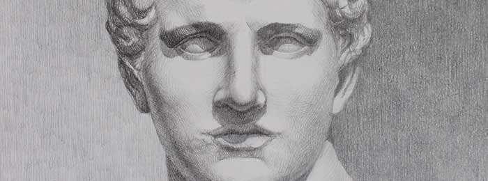
In the Drawing Academy video lessons, you will see tonal values rendered with distinct visible pencil strokes. The variety of pencil pressure, length of the strokes, their direction and curvature, as well as the strokes patterns create a gamut that makes the drawing more interesting and individualized. Such gamut gives a work of art a recognizable personal style.
In the drawings of the Old Masters, you can see the “hand” of the artist, while the technique of drawings coming from Atelier artists makes them look very much alike.
I have seen some amateur artists and so called ‘teachers’ showcasing graphite rendering smudged with a paper stump. This is one thing you must not do in graphite drawings. Smudged graphite looks like mud. A unified, smooth surface with a lack of gamut gives a dull appearance to a drawing.
It is up to you what pencil hatching method to use. I would suggest that you master hatching technique with separate lines first.
Later on, you can try a “smoother” approach and decide for yourself what you prefer.
Best regards,
Vladimir
- Receive 15 new videos monthly (45 in total)
- Incredible discount – $4,164
- Bonuses - Fine Art eBooks and Videos
- Drawing Academy Diploma of Excellence after course completion in 3 months
- Personal coaching by Drawing Academy Tutors
- Lifetime membership. Free after the 3rd month

- Immediate access to all 45 video lessons
- Incredible discount – $4,198
- Bonuses - Fine Art eBooks and Videos
- Drawing Academy Diploma of Excellence after course completion in 3 months
- Personal coaching by Drawing Academy Tutors
- Lifetime membership. No more payments
This Post Has 0 Comments