Feedback on Ray Habyan’s drawings
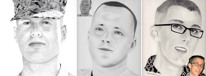
Artworks by Ray Habyan, Drawing Academy student
Ray Habyan’s website: //www.fromphotostoportraits.com
Hi Ray,
Welcome to the course!
I hope you had a first look on the Drawing Academy membership area and found your way to video lessons and bonuses. Please let me know if you have any questions.
As promised, I will give you my feedback on your drawings.
First of all, you have a talent and most importantly, you have a passion. It will lead to results you want to achieve.
In regard to drawing techniques, there’s always a room for improvement, no matter how great an artists is.
Here’s what I see in your drawings:
1. You need to learn how to draw what you know rather than copy what you see. This is the most important point from the list. This rule applies to every point below.
2. You are very accurate and want artworks to be perfect. Sometimes less is more. You are an artist and therefore have creative license not to draw with precision every part of a face you see on a photo. You can decide what parts you want a viewer to focus on and render other parts with less attention.
3. Aerial perspective – this partly comes from the previous point. In aerial perspective, objects that are further away from a viewer need to be rendered with less contrast, fewer details, and more blurred, thus creating an illusion of atmosphere around.
4. Constructive drawing – your drawings give a sense that they have been copied, not “built”. Constructive drawing is very much “drawing what you know”. It helps to avoid mistakes and makes artworks more believable. Constructive drawing combines many rules such as perspective, drawing objects as if they are transparent, thinking about proportions, using helping lines like axes of symmetry, edges of planes, lines connecting various points, etc.
5. Proportions – once again, this is about drawing what you know. For example, the portrait of a fellow with glasses will look better if the horizontal line of eyes be located a bit lower (despite it is quite high on a photo). You know that this lines divides the height of the head in half, we see the head from below, which puts this line a bit higher, but as an artist you can decide how much higher to give a sense of linear perspective while avoiding photo-perspective.
6. Composition, including Lead room or nose room. When composing a portrait on a blank piece of paper, you want to make sure that a head looks good and proportionate to the drawing area. Going for too big or too small of a head for a paper size might ruin the artwork even before you started. As the rule of thumb, make sure that a head is positioned with a bit of less space above the head comparing to the space below. Also, give a bit more room in front of a face (nose room) than behind. The portrait of a fellow in glasses will benefit from a lead room.
7. Tonal rendering techniques. I have a feeling that some parts of your pencil thatching have been smudged with a stump or made very smooth by delicate pencil scribbling. Actually, such treatment of graphite results in mud. The beauty of graphite pencil medium is in individual strokes. It is counter-intuitive; the smoother you do rendering, the less appealing it looks. Don’t be afraid of visible strokes even in smooth places like a cheek. However, rendering in strokes has to be done proficiently. It includes rendering along contours in wide enough gamut of pencil-strokes. It is like handwriting. Your individual style of hatching shows your hand, that what makes your artwork unique and valuable. Just as an example, think of a letter by Leonardo da Vinci done by his hand, it costs hundreds of thousands dollars. The same letter perfectly typed and printed is worthless.
I think this initial feedback gives you some information to think about. Please come back with any comments and questions you might have, I will be happy to continue.
One more advice – it is better not to mention how much time your artwork takes to make. Keep it private. With time your art will be valued according to its artistic value, not to the amount of labor involved. I’m often asked how long does it take; my answer is “It took me 15 years of intense art education and 25 years of practice to create this artwork”.
To your creative success,
Vladimir London
Drawing Academy tutor
- Receive 15 new videos monthly (45 in total)
- Incredible discount – $4,164
- Bonuses - Fine Art eBooks and Videos
- Drawing Academy Diploma of Excellence after course completion in 3 months
- Personal coaching by Drawing Academy Tutors
- Lifetime membership. Free after the 3rd month

- Immediate access to all 45 video lessons
- Incredible discount – $4,198
- Bonuses - Fine Art eBooks and Videos
- Drawing Academy Diploma of Excellence after course completion in 3 months
- Personal coaching by Drawing Academy Tutors
- Lifetime membership. No more payments
Vladimir,
Thank you so much for taking the time to look at my work and critique it honestly as a professional. The 7 items you listed are absolutely spot on. I have only been drawing for 3 years and am 68 years old. I had no idea I could do this until now.
I believe I can learn new habits and improve my style. Your help will be crucial in this endeavour. I really do look forward to working with you and in time, you might get upset with me bothering you for advice. I am sure you will be a great mentor to work with.
Your Friend,
Ray
I enjoyed reading the critique and constructive criticism. Also it is nice to see someone further along in life learning drawing. I am almost 58 and it is exciting to know I can improve. I am impressed with the detail of the critiques as well.
Jamie
Hello Ray. Welcome to the group.
I became an academy student about three weeks ago. I am just two years younger than you are and have been involved with art for over 40 years and even although I give art instructions on a one-to-one or to small groups, I am still learning.
If you have been drawing for only three years you must have a natural flare for art to draw as well as you have. The two things that strike me are; 1 – the proportions of the face are a little out to my eye; especially around the nose to chin area, and 2 – the shading, as Vladimir mentioned, looks like smudged graphite, which I myself use to do a lot of and thought the results were great. But now, learning new ways of rendering by hatching, I see smudged work in a different light. The shading looks too smooth, thereby having no character or life. When I look back at my own smudged graphite works, I now see dead drawings, not lively drawings.
I am sure Vladimir will be of tremendous help to you. He has certainly helped me progress further with my skills over the past couple of weeks by taking me away from smudging and on to the richness of hatching. Good luck with the course.
The critiques have been very thorough and surely to be of strong help in further developing your drawing skills…
I found the conversation here insightful. I realized that perhaps one of the main difficulties in drawing from a photo is that one is looking at the subject as if with one eyed closed, a trick normally reserved as an option to help discern shapes by removing the 3D effect of seeing with both eyes. And so there is a need to pull up in ones imagination what would normally be seen with both eyes open, and giving a two dimensional photo or image the three dimsionality that makes the subject come alive on a flat surface.