Discover Pen and Ink Techniques
Video Lesson Description
In this video lesson, you will discover a variety of Pen and Ink Techniques that can be used for drawing in ink.
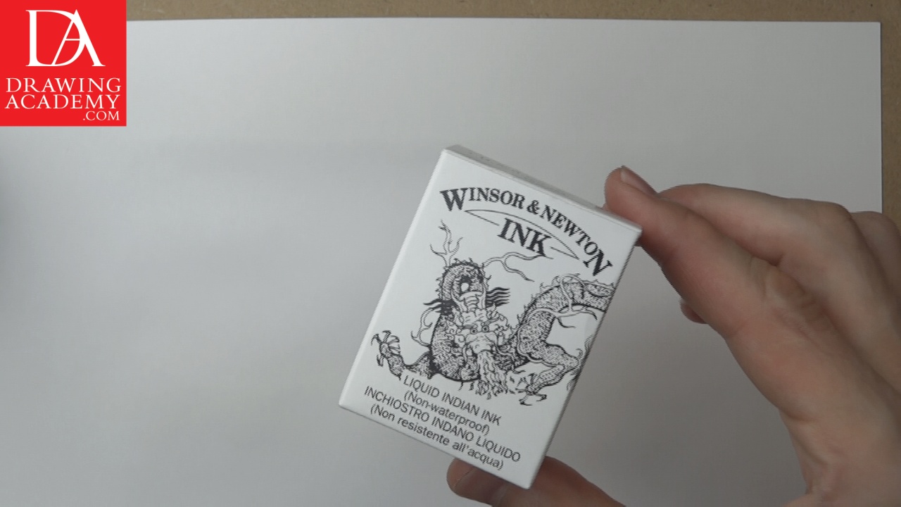
For that task you will need a metal nib and black ink. Your local art supply store may have various metal nibs; you need just one or two.

Pen and Ink Techniques – Hatching in Black Ink
To demonstrate the Pen and Ink Techniques I will use nibs from the Leonardt England range. This range offers traditional metal nibs with different tips that produce a variety of lines. Sharply pointed tips will give thin lines, while the Leonardt Round series has wider writing tips and makes much wider lines. The lower the number a Leonardt Round nib has, the wider line it produces. Leonardt Round nibs are good for calligraphy and I will present a special video lesson later on during the Drawing Academy course.
The simplest one is parallel hatching, similar by width and length lines, marked next to each other. The direction of line in this example goes vertically from the top to the bottom direction. Light pressure is applied on the pen, so lines are quite thin.
The next of pen and ink techniques is very similar to the previous one; however, lines are drawn with more pressure on the pen, which produces thicker lines.
The following method from the range of the pen and ink techniques is also based on vertical parallel lines, but this time a varying pressure is applied. A thin line starts with little pressure on the pen, then pressure gradually increases, making the line wider, until the nib reaches the mid-point of the line; afterwards, pressure decreases for a thinner line once again.
Now I am hatching with diagonal parallel lines using the main diagonal, which goes from the top-right to the bottom-left. This pen and ink technique requires light pressure on the pen to leave thin lines on the paper. When the first layer of hatching is done, I, once again, go over the previous layer with lines now going in an opposite diagonal – from the top-left to the bottom-right. This method is called, cross-hatching.
The same manner of cross-hatching is repeated with more pen pressure, which gives a much darker tone to this ink rendering.
There are also cross-hatching pen and ink techniques. When an even darker tone is required, the cross-hatching can be done with more than two layers. In this example, I am hatching in both diagonals as well as in vertical and horizontal directions. With five layers of hatching, this square has a much denser mesh of lines.
This time I will do horizontal lines, starting from a very light pen pressure and thin lines, gradually increasing the pressure and making wider lines. The tonal value increases from the top to the bottom.
All previous pen and ink techniques were done with straight lines. Now, however, I am using wavy horizontal lines as if I am writing very miniature characters from left to right. Such rendering gives a specific textured appearance. Once again, the pressure on the pen can be increased to the end to deepen the tone of hatching.
In this example of pen and ink techniques, I am producing a series of short lines grouped together. Groups of lines are placed next to each other. This gives another textured look to the hatching. Short lines are slightly curved and not highly uniform which gives an irregular look to this texture. Groups of lines are not overlapping each other, so borders between them are clearly visible.
This is a variation of the previous pen and ink techniques. This time, I do much shorter and finer lines at the beginning and gradually increase the pen pressure so lines become bolder, making the tonal value darker. This gives an interesting 3-dimensional look to this rendering.
This method has the sequence of short and much curved lines arranged in small groups. Such hatching has quite a decorative look for such an organic looking pattern. I am trying to leave no gaps between groups, without overlapping lines too much.
- Receive 15 new videos monthly (45 in total)
- Incredible discount – $4,164
- Bonuses - Fine Art eBooks and Videos
- Drawing Academy Diploma of Excellence after course completion in 3 months
- Personal coaching by Drawing Academy Tutors
- Lifetime membership. Free after the 3rd month

- Immediate access to all 45 video lessons
- Incredible discount – $4,198
- Bonuses - Fine Art eBooks and Videos
- Drawing Academy Diploma of Excellence after course completion in 3 months
- Personal coaching by Drawing Academy Tutors
- Lifetime membership. No more payments