Artwork critique
Artwork and story by Jean Botha, Drawing Academy student
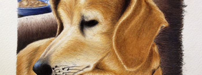
For some time, I desperately wanted to do a picture of my dog, Poppy. She is my favorite of the dogs. A very good sense of herself, asserting her loyalty with confidence and conviction when barking at strangers in the presence of her pack leaders “Be warned! I am small but I will defend my pack regardless of your size or what the outcome might be.” Strong in character and resolve. I have no doubt this dog walks her talk. I admire that in her.
A playful dog. Seeking out your attention for a play on the carpet. Affectionate without being needy. She loves a good cuddle, and I love the way she cuddles. Feeling her physical contours under my hand as she is nestled in to my body, a shared experience of intimacy, I watch her and see how enthralled she is in the experience. Decadent. Revealing in shear decadence she is. And I love that about her the most. Unapologetic reverence in the delight.
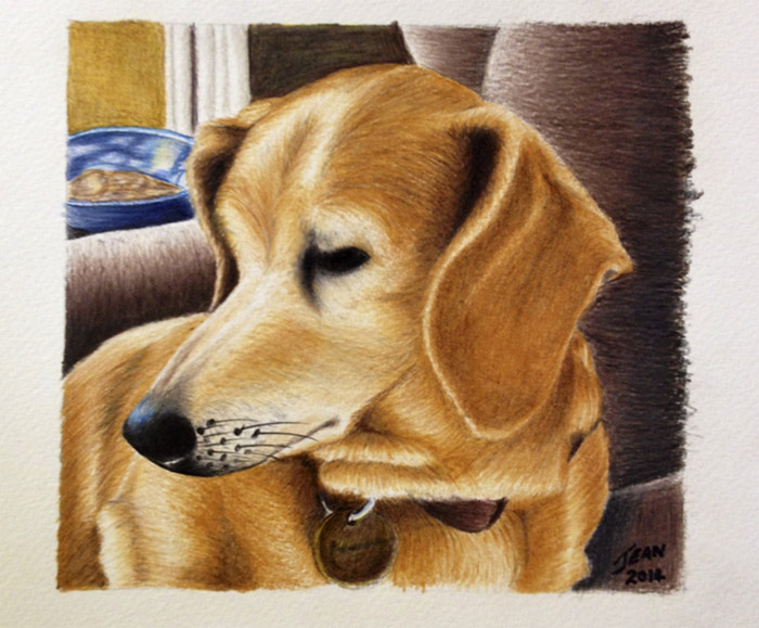
Faber Castell Polychromous colored pencils on Borges 300gsm rough watercolour paper 18cmx18cm
Vulnerable and selfconcious. That is what this image captured for me, even though it wasn’t the aim, it was the best looking pic I could take of her at the time. She just wouldn’t pose for the camera. She became highly self-conscious and fled for safety on Darrn’s lap on the couch, Shying her face away as I hasted to get the shot.
I only realize now how much of Poppy I see in this picture, and appreciate it more as time goes by.
Self-Critique:
My creative aim was to try and get photo realism. Outcome: failed.
I love this picture more and more as time goes by. Despite the failure to achieve the goal and all its perspective distortions, I honestly love the outcome. Cartoony looking but striking with color saturation and exposure.
What can be improved:
The most obvious perspective error that an untrained eye will notice is the distortion of the blue bowl behind her. Just drawing what I thought I saw and not knowing to draw what I didn’t know to draw at the time resulted in this distortion.
The vanishing point for the perspective of the bowl is located on a much higher horizon line than the actual point of view from which this picture was taken from, resulting in more of the back plane of the ellipse being visible at the top plane of the bowl, making it look odd because you get the sense that you are seeing the dog from the front yet the further object is seen from above.
Had I known about drawing ellipses in perspective, I could have corrected that error in the construction phase.
Moving forward in the image, I feel a subtle or gross misrepresentation of the foreshortening of the rounded planes of the chair she is sitting on. It looks too round. Yet in keeping with the light direction, not too obvious I thought. A minor mistake that I’m still not sure how I could more accurately portray it (any advice would be appreciated) . But the perspective of the whole chair, the horizontal planes of the arm resets, give a correct sense of the object in space.
On the dog, the only perspective issue I can notice is that her snout is drawn too long. It should have been drawn a little shorter and narrower to accurately suit the size of the rest of her.
I also feel that I lost the main event here which will be her expression. At one stage of the drawing I captured her anxious frown which really depicts what this image is about. But I managed to loose it with overworking her eye, which has no depth or volume and appears like a black void, rather than a very dark round object. Resulting in a muted expression of her displeasure and uncertainty of the photo taking process.
What is right:
I feel that my forms accurately represent the fall of light from the left hand rear window, except for the front of the subject. It is drawn over exposed. In the reference the bottom parts of the dog in the foreground are actually much darker. I didn’t notice it at the time of drawing or completion, distracted by excitement of accomplishment. Now, technically this could be a fail, because it looks like there was a very bright reflective object below the viewers eye level illuminating the lower aspect of the subject. Personally, I can overlook this oversight and feel the subject is pleasantly, if not more emphatically, represented by this over exposure. A happy accident.
I feel I have done a good job representing the volumes of the shapes in all the objects, Paying particular attention to stroke length, pressure and direction of stroke to successfully represent the volume as well as the textures over the volumes, flowing with the direction of the plane changes, representing shadowed areas with darker tones. I particularly like that despite the loss of her expression, I accurately captured the gesture of her pose. Head turned away, leaning on her left shoulder while her right leg is slightly forward and extended to some degree.
I feel I balanced the colors well here. Orange is the main player here, and can be quite unsettling and overpowering in large volumes. The complimentary blue accent of the vase I particularly like in this color scheme, just enough to create some “pop” among all the orange and earthy tones. I was very perplexed about what color to use for the the chair. Initial speculations were around using a blue to try and balance the large orange mass, but that didn’t seem fitting for some reason, so I opted for a cooler dark brown to push the subject more forward but also balancing the vulgarity of lots of orange. I’m glad I did. I feel it works. Cool brown still echoes a warmth that is in keeping with the setting of a warm and inviting living room, while harmonizing with the orange and creating depth with tonality.
This is my first ever analysis of any art work. I am still an amateur, just trying to put in to words what I see I have done, both objectively and subjectively.
Please feel free to comment on your observations in the spirit of supportive criticism to help me understand this lovely thing called art better.
Drawing Academy Tutors
Hi Jean,
Many thanks for your drawing and report.
We like this artwork a lot and have to say that it is great that your goal of getting photo realism has failed.
Think what do you want to achieve – become a human photocopier or creative and unique fine artist?
If you do the most perfect replica of a photo, such artwork becomes as disposable as the photo itself. Photos can be reproduced by mechanical means and therefore their value is negligible.
However, if you do one-off creative and unique artwork, it has the potential of becoming a treasure in its own rights.
When creating photo realism by copying photos, your talent as an artist is not present, you simply replicate the talent of a photographer.
We hope you see why we’re glad that you haven’t achieved this particular goal.
We wish you creative success and original creativity.
![]() Kind regards,
Kind regards,
Natalie Richy and Vladimir London
Drawing Academy tutors
- Receive 15 new videos monthly (45 in total)
- Incredible discount – $4,164
- Bonuses - Fine Art eBooks and Videos
- Drawing Academy Diploma of Excellence after course completion in 3 months
- Personal coaching by Drawing Academy Tutors
- Lifetime membership. Free after the 3rd month

- Immediate access to all 45 video lessons
- Incredible discount – $4,198
- Bonuses - Fine Art eBooks and Videos
- Drawing Academy Diploma of Excellence after course completion in 3 months
- Personal coaching by Drawing Academy Tutors
- Lifetime membership. No more payments
This Post Has 0 Comments